
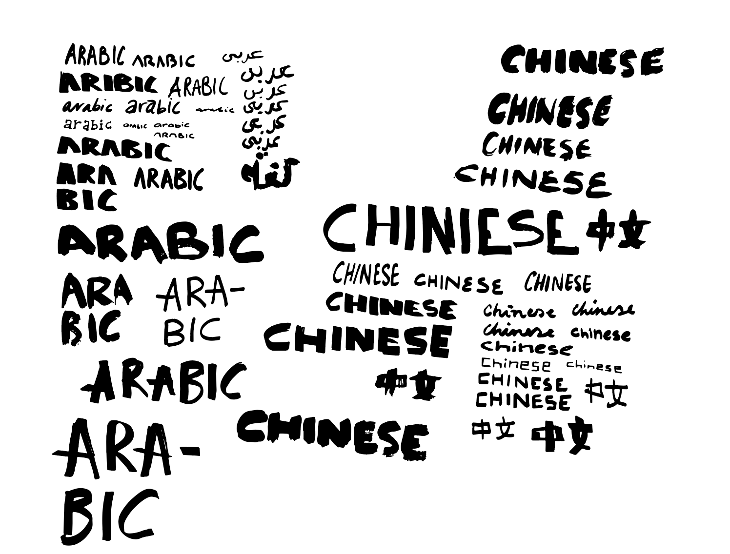
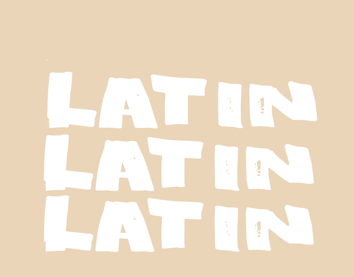
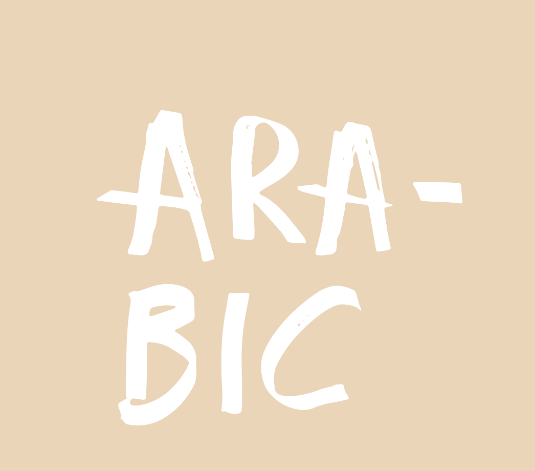
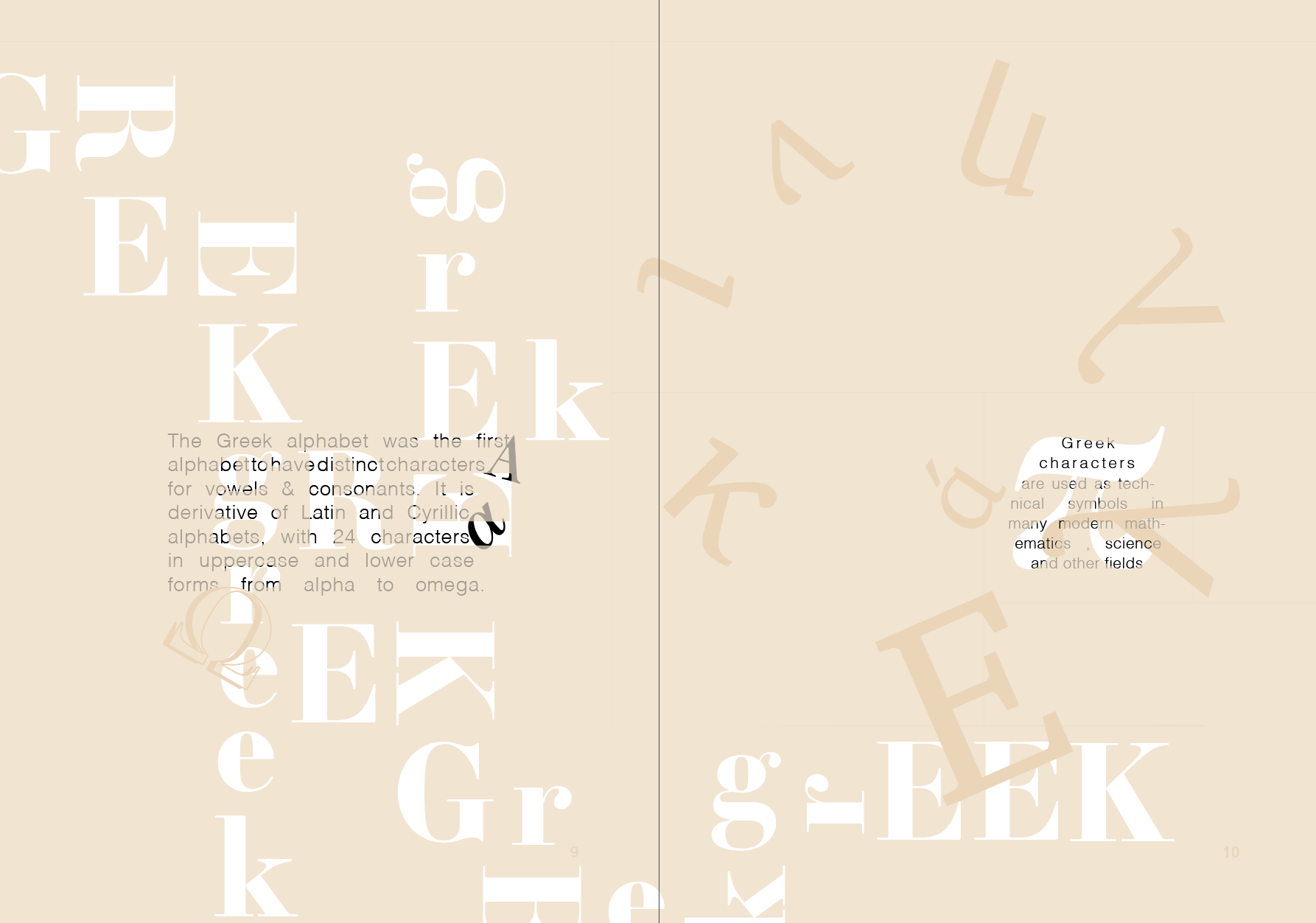
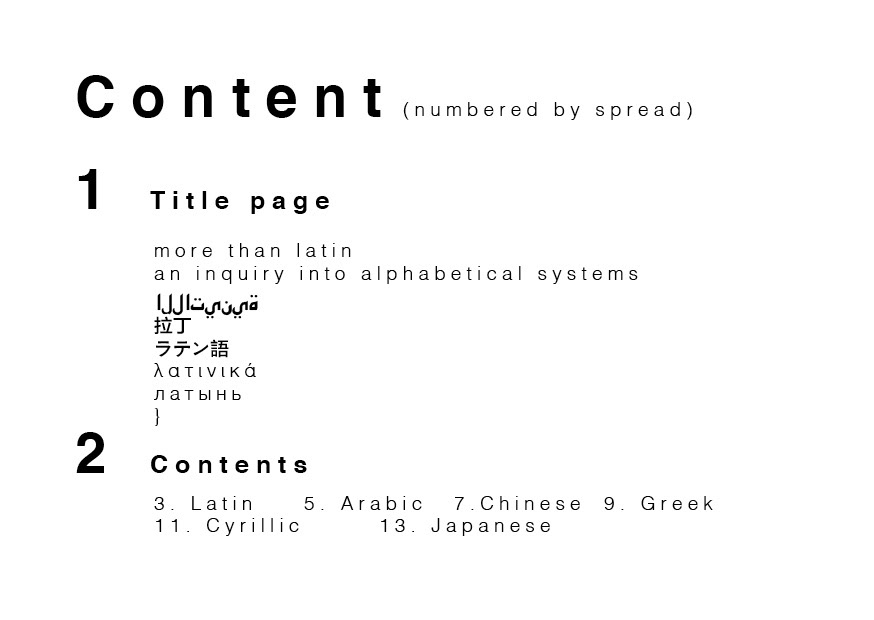
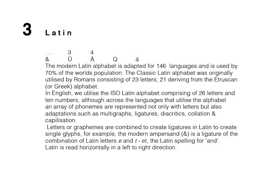
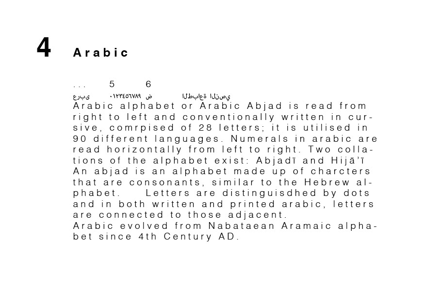
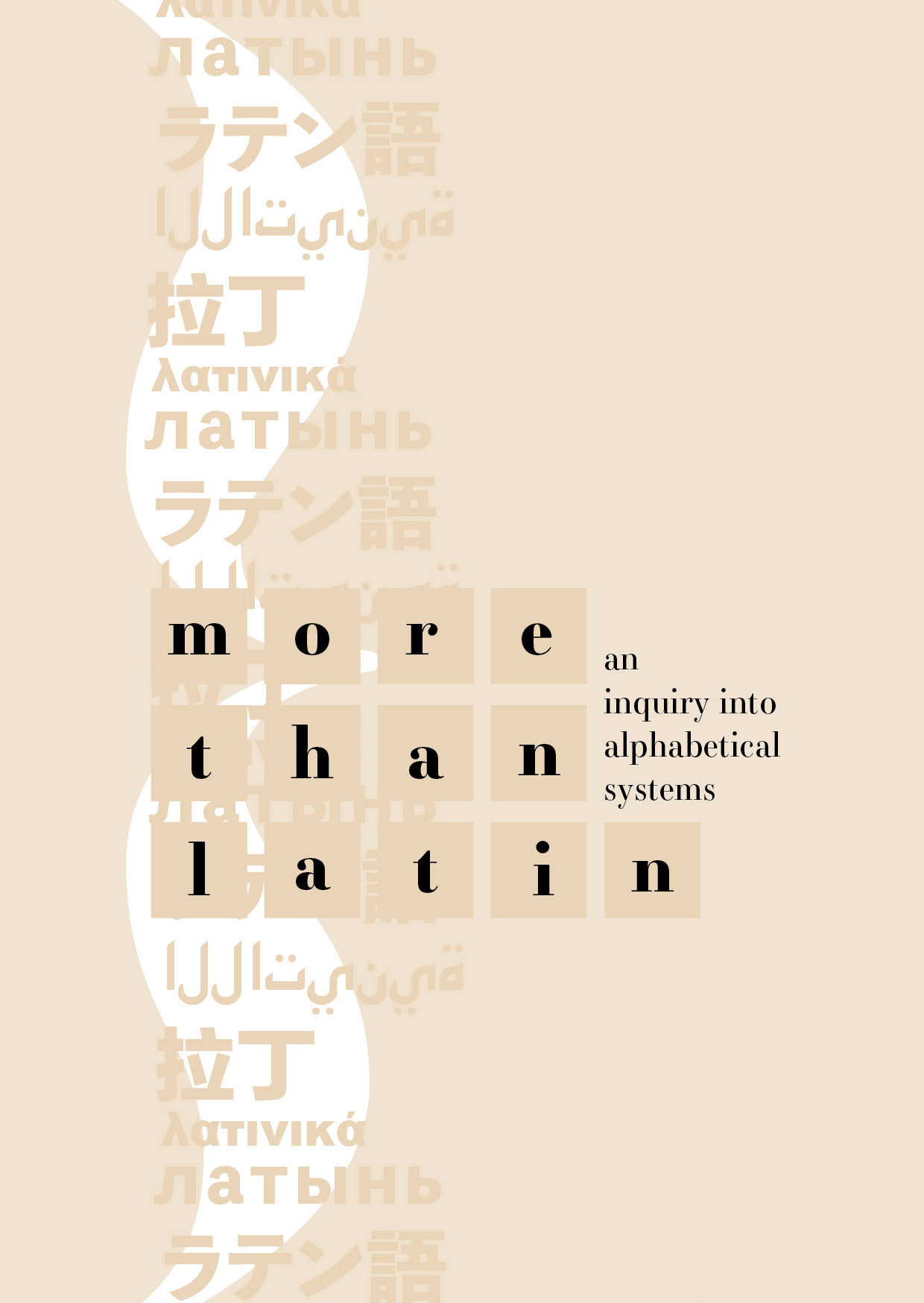
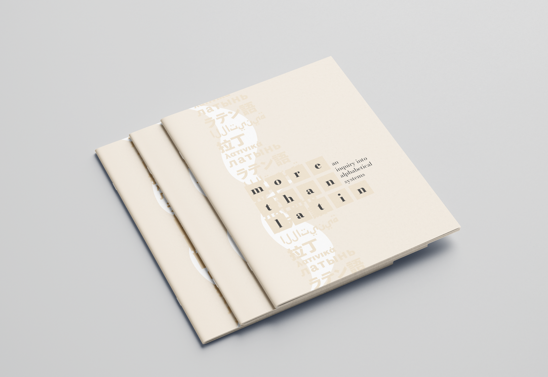
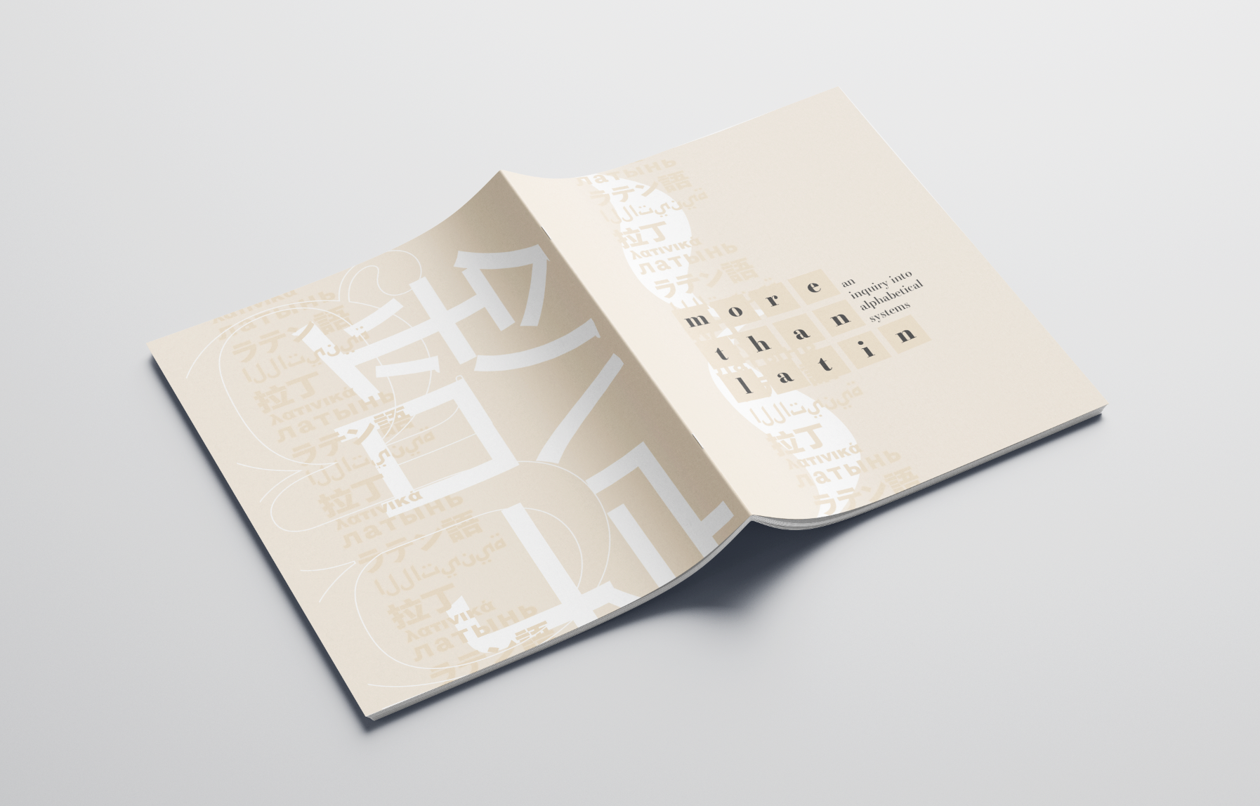
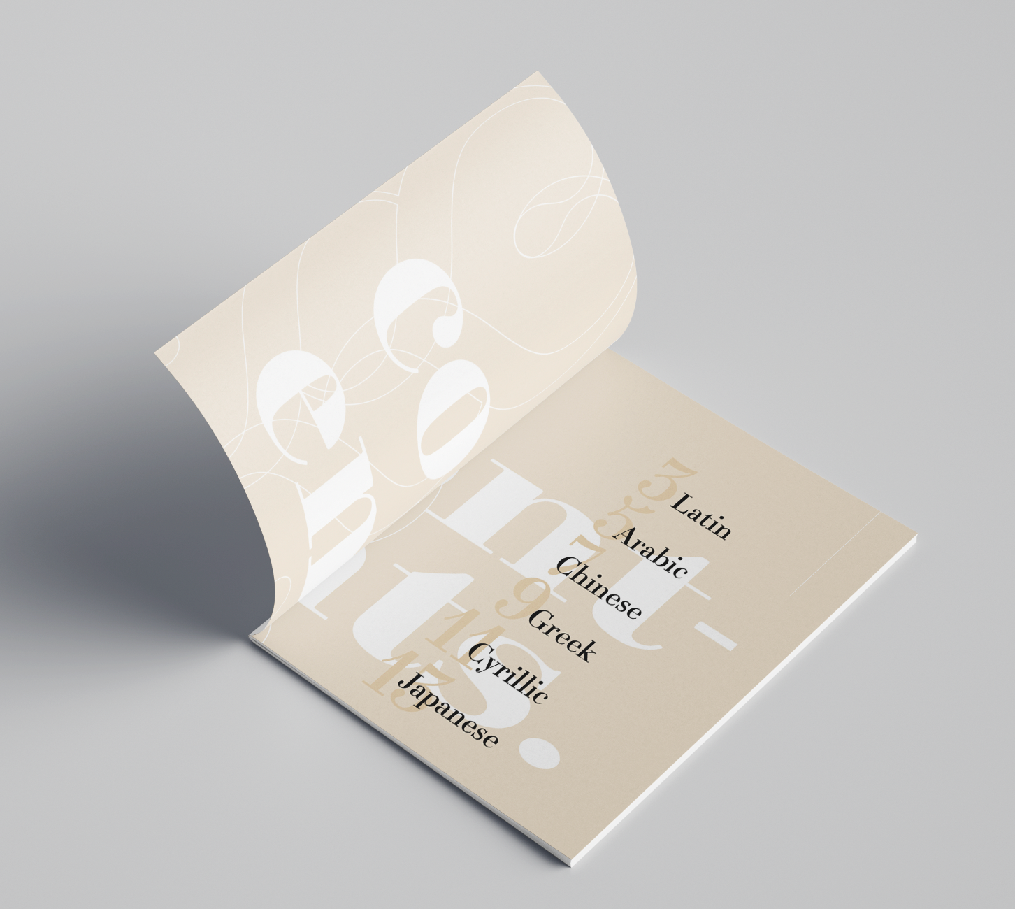
The typographic concept of exploration for my zine was typography & alphabets of various written systems. More than Latin explores the systematic notes of Latin, Arabic, Chinese, Cyrillic, Greek and Japanese writing & typography.
Part 1: Research
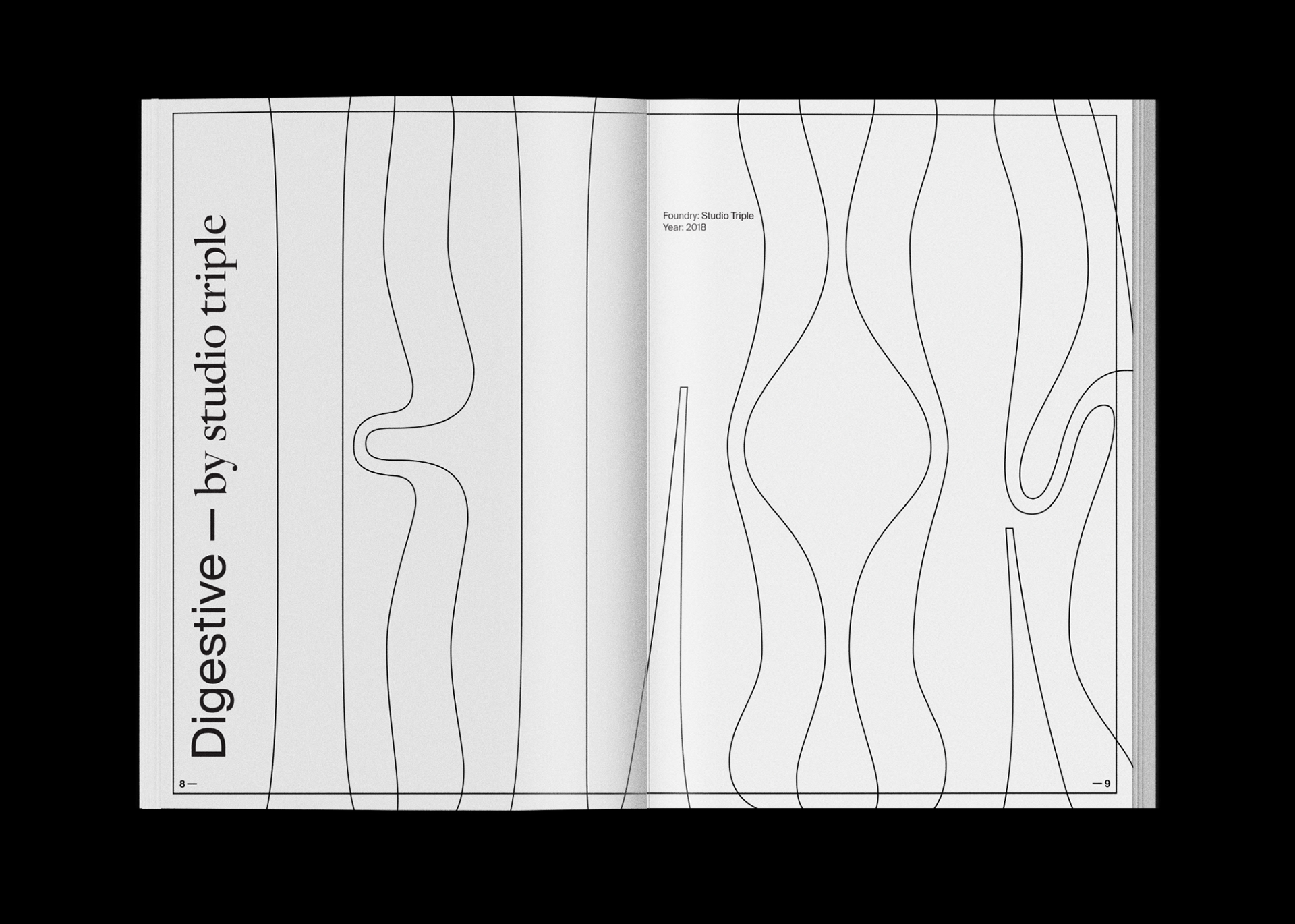
OH MY GRID by Jonathan Foo
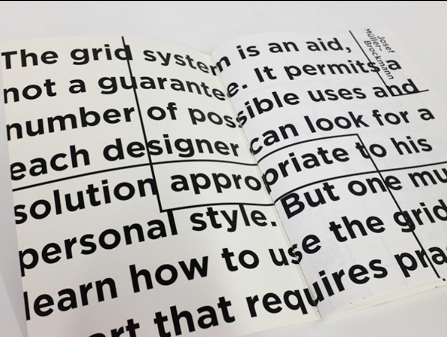
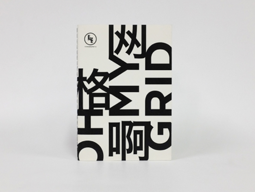
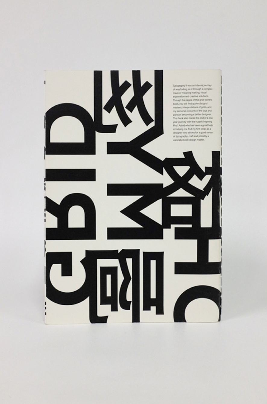
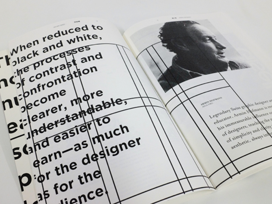
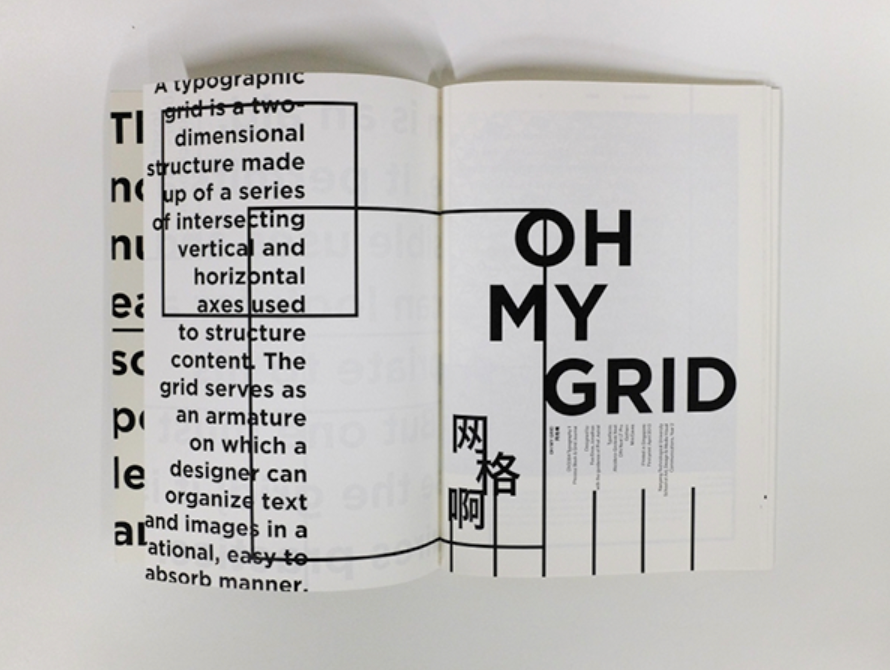
Oh My Grid focuses on utilising the grid structure throughout, sometimes more distinctly than in other areas. Foo explores many different aspects of typography, and in some areas, alternative scripts are utilised. A black and white colour scheme in combination with monochromatic images make the editorial a consistent aesthetic throughout.
Foo explores typographical styles, concepts and philosophies, while also experimenting with the graphical elements of glyphs and typefaces; not limited to the Latin Alphabet.
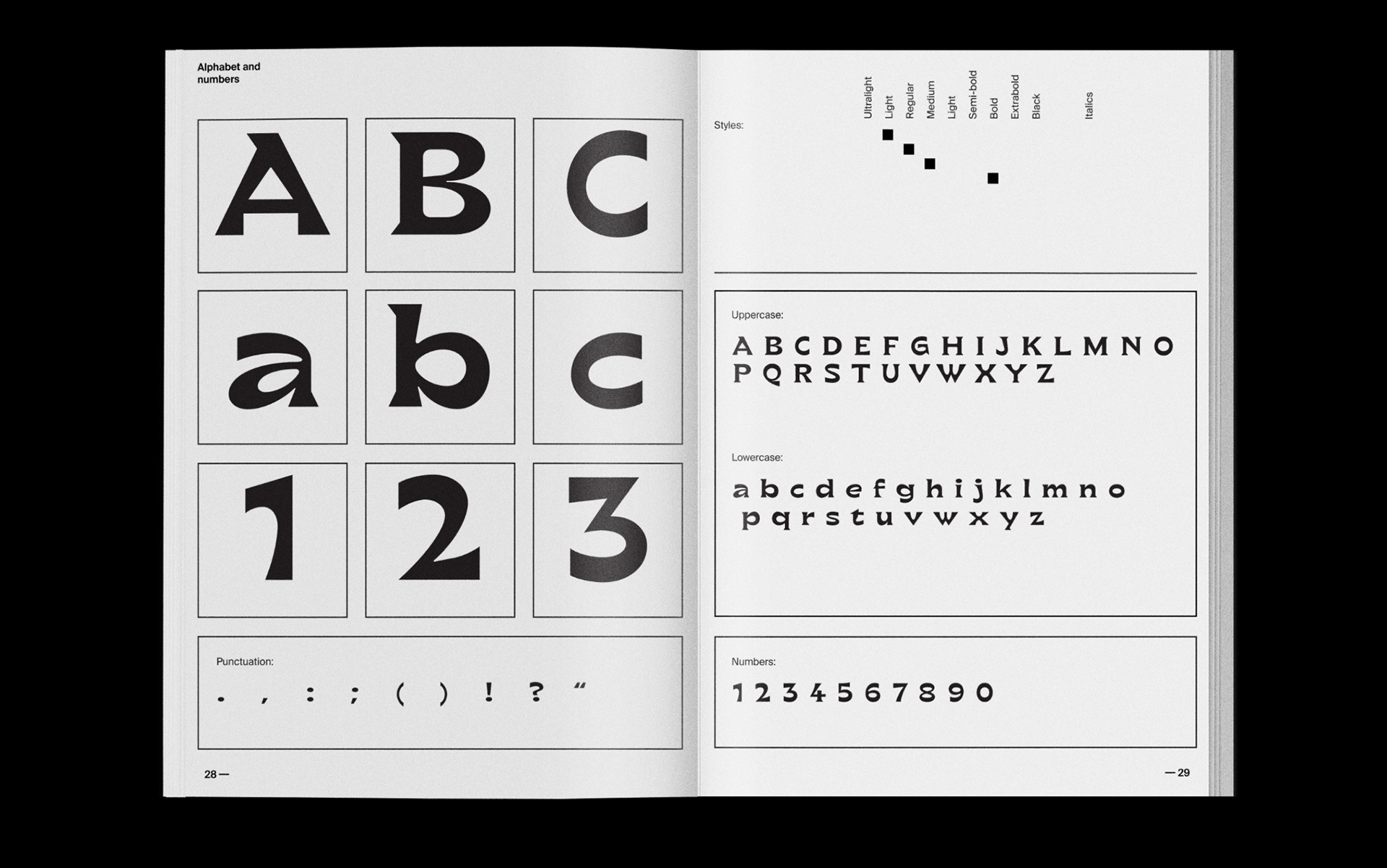
TYPOGRAPHIC UNIVERSE by Emily Capling & Elise Reina
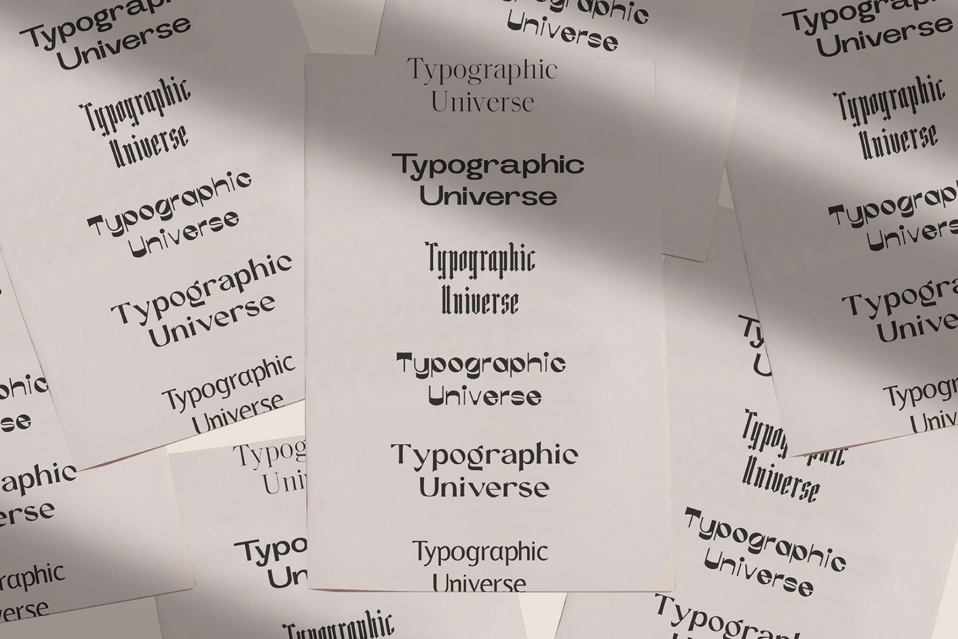
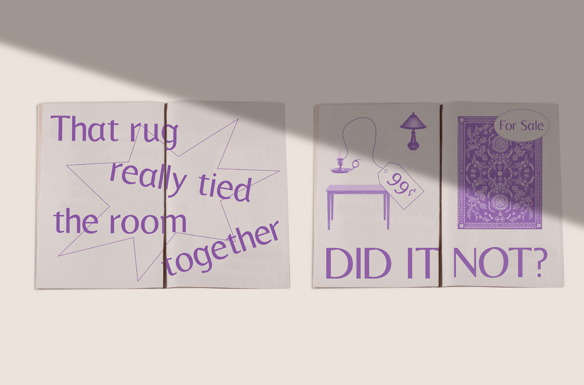
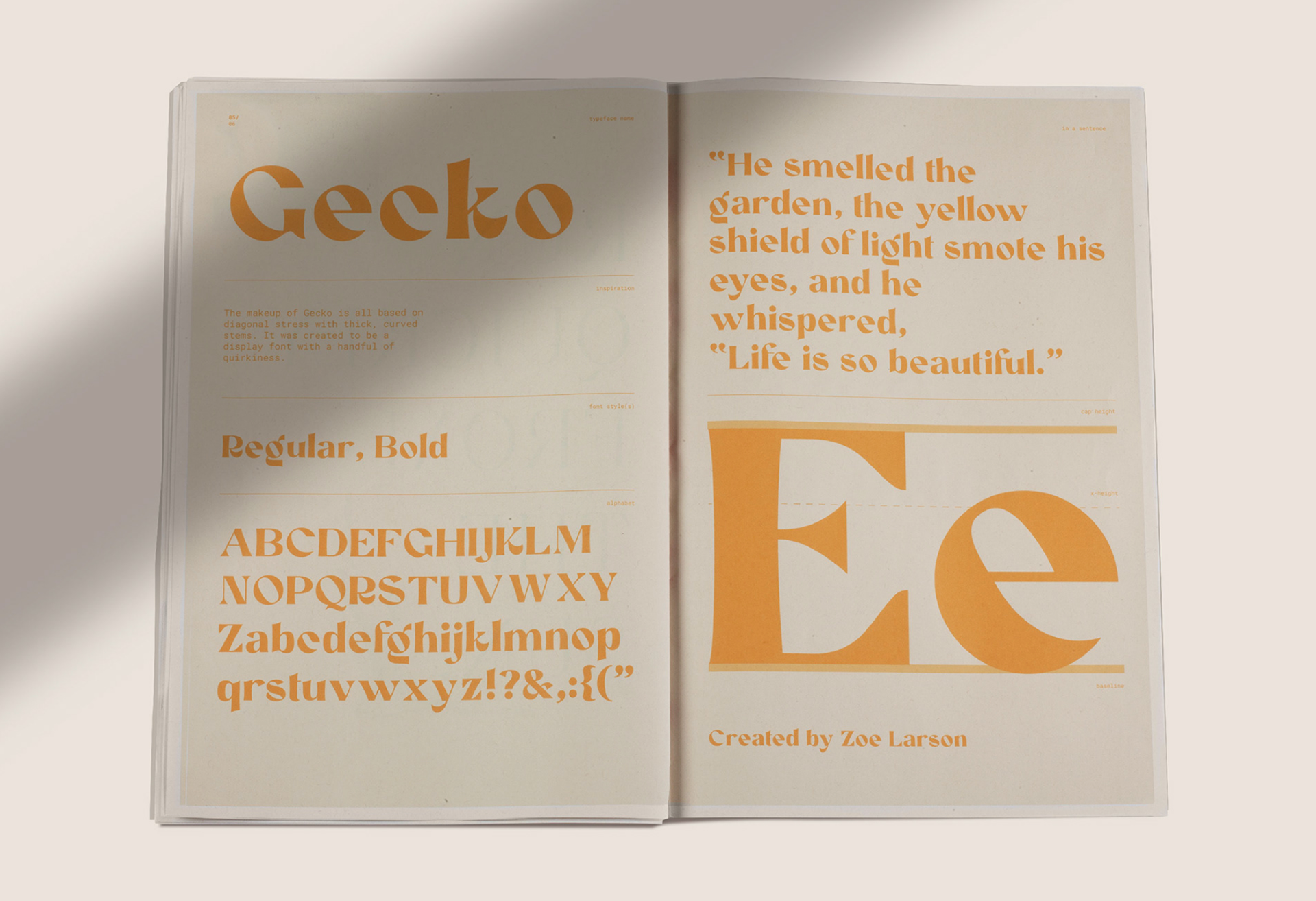
Typographic Universe delves into the characteristics of experimental typography and applies typefaces as an exploration of the topic itself.
Each typeface is assigned a colour, clearly distinguishing them from one another and this further creates a clean aesthetic despite the variation of styles. Pictorial spreads don't appear to use strict grids, although pages dispelling features of the typefaces are consistent within each and follow the same single-column grid system.
Highlighting the key notes of the typefaces, Capling and Reina establish hierarchy of information with scale, and although key notes are the smallest elements, they have recognised that key notes can be identified by visually examining the glyphs initially, hence the Capital and lowercase large-scale glyphs on each information page.
I'M SO F*CKING SICK OF HELVETICA by Andrea Bianchi
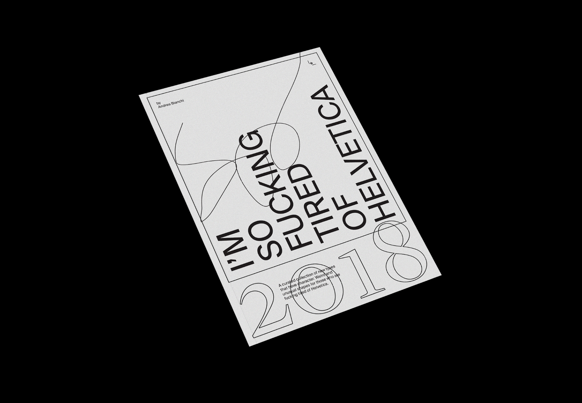
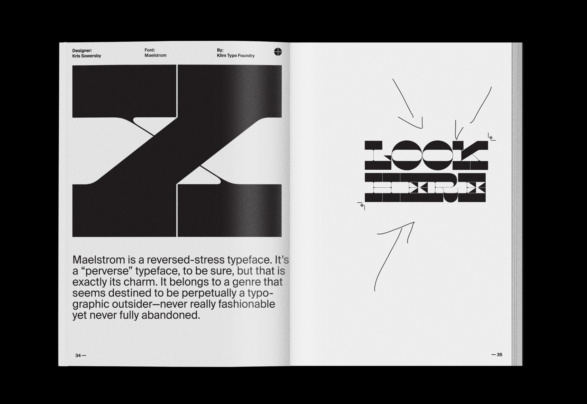
This zine explores experimental type with the goal of displaying the methods it can be used in commercial projects, rather than typefaces we commonly see repeated on many digital and analogue platforms/publications. Bianchi utilises the technical aspects of glyphs to design pages, using a multi-column grid structure.
I'm So F*ing sick of Helvetica adopts the methods of the Futurist movement, where designers ventured from traditional poetic publication styles to a new world sans-serifs, mimicking the likes of Filippo Tommaso Marinetti's manifesto Destruction of Syntax–Wireless Imagination–Words-in-Freedom. Although here, she challenges the flatness and mediocrity of modern day typography.
"To come to terms with the complexity of this typographic practice (experimental typography) requires a critical inquiry into it's structure, forms and processes." (Drucker, 1994). Bianchi in the zine critically analyses the typefaces and their origins, explore where they have been used previously and further applies this in her own critical design, communicating a vivid understanding of the typefaces.
ITERATIVE PROCESS
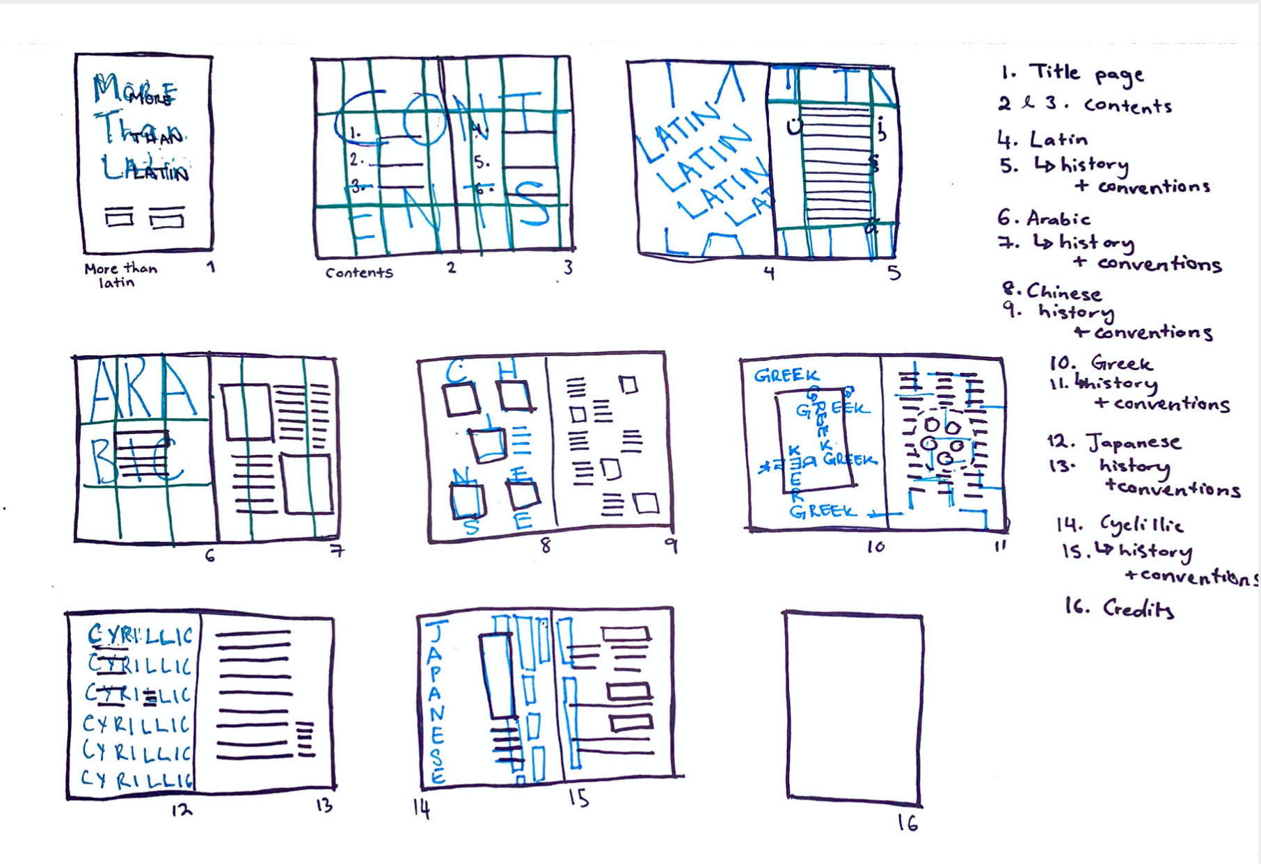
Initial ideation of spreads explored possible grid layouts and positioning of titles, and considerations of text layers to explore spread navigation.


From ideation of spreads i began to explore hand drawn text to create an artistic and experimental element to the zine, this allowed for quick ideation and consideration of the typefaces I would consider using to reach my desired aesthetic.
Although i did not use these concepts in my final zine, i explored them digitally, which I then utilised the structures with typefaces to achieve a consistent design style throughout,


SPREADS
Plan:

Grid system
Multi-column Grid Structure
FINAL ZINE

Key notes:
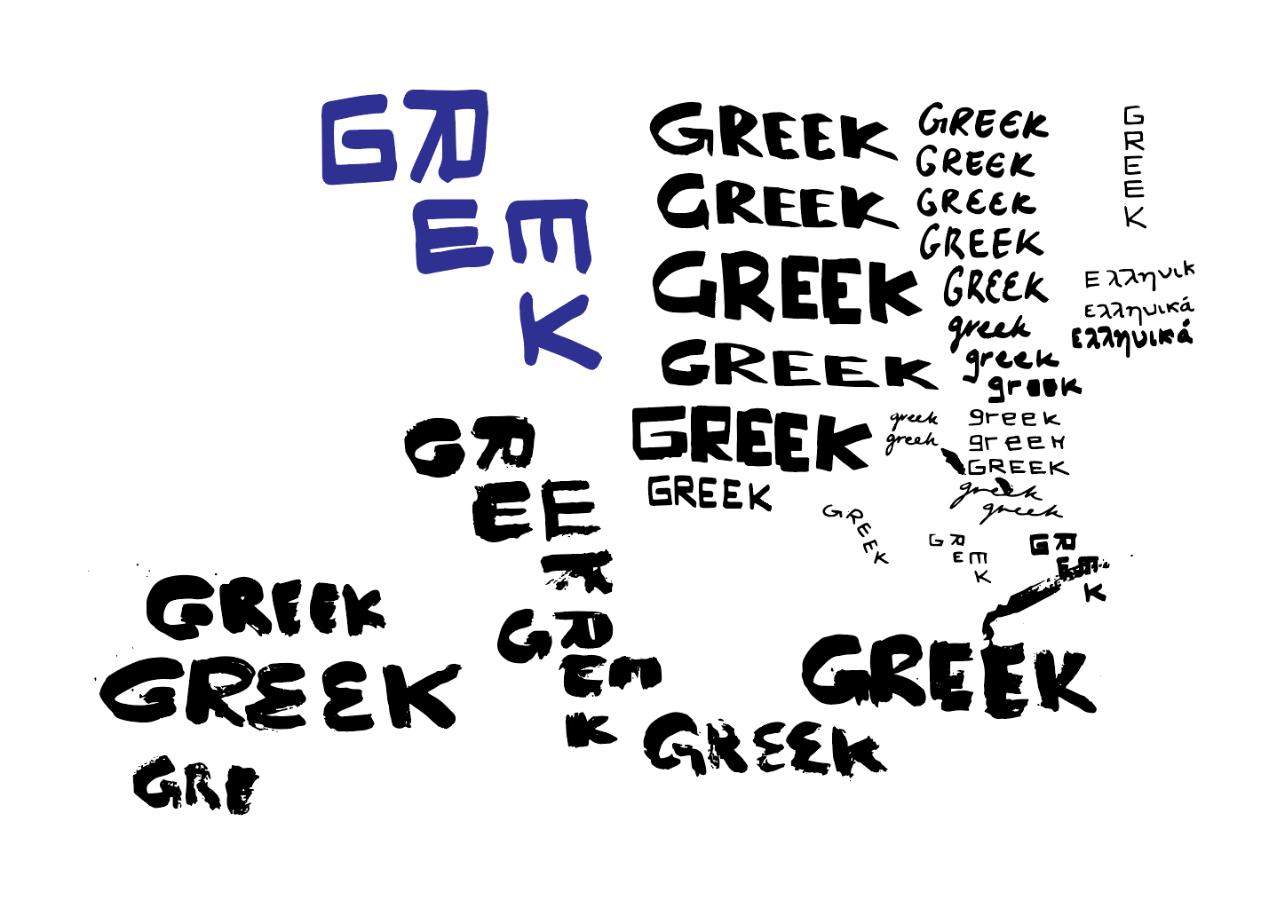
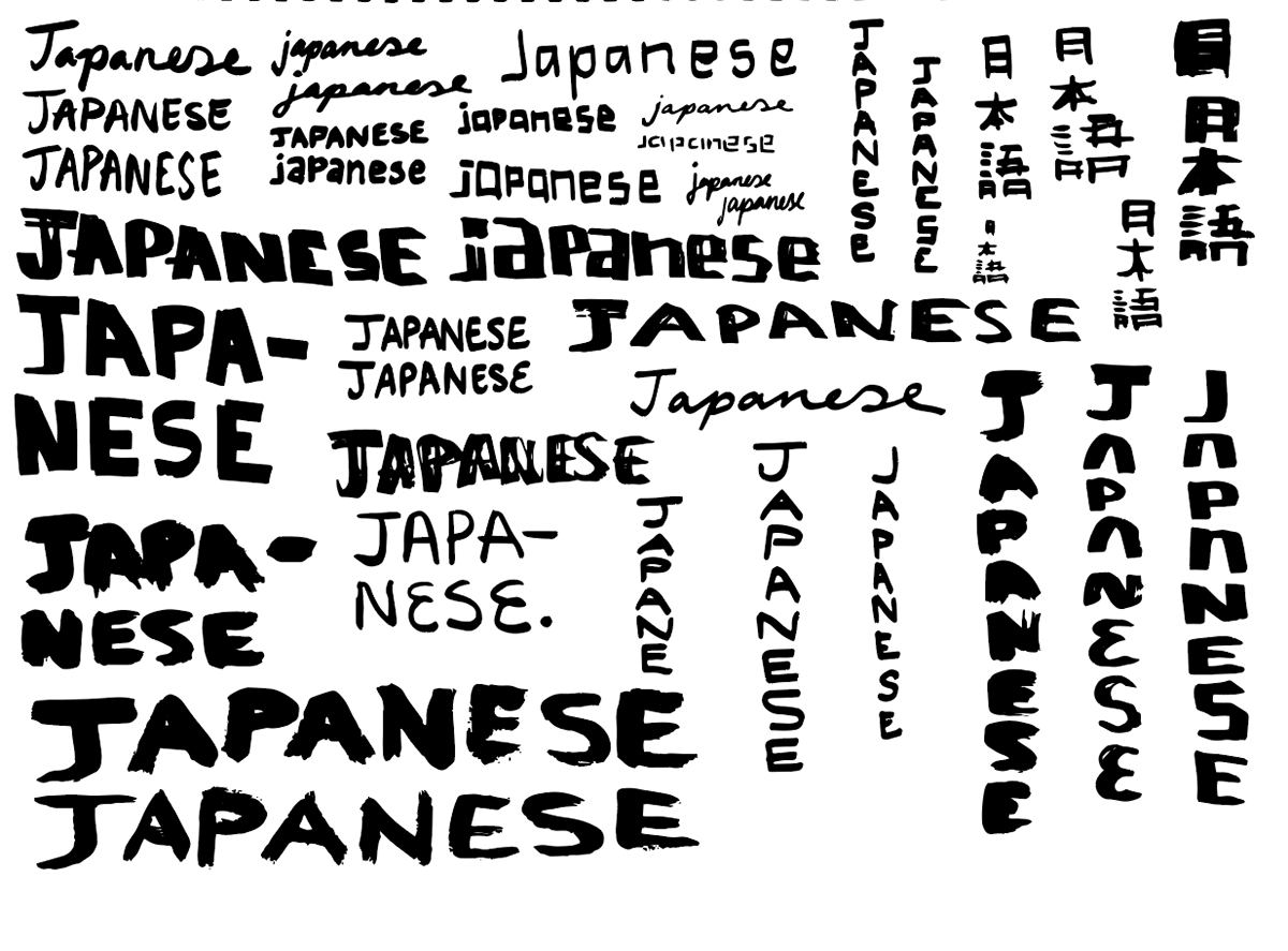
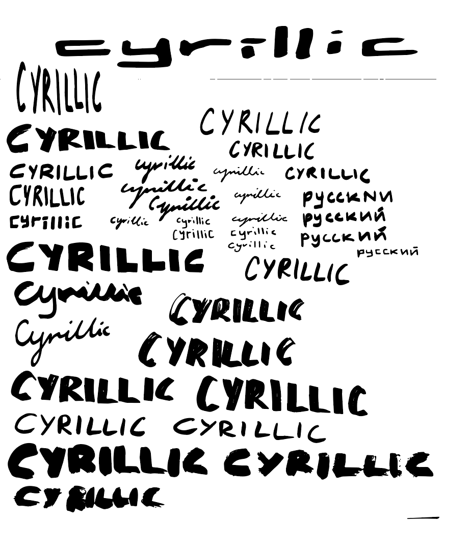
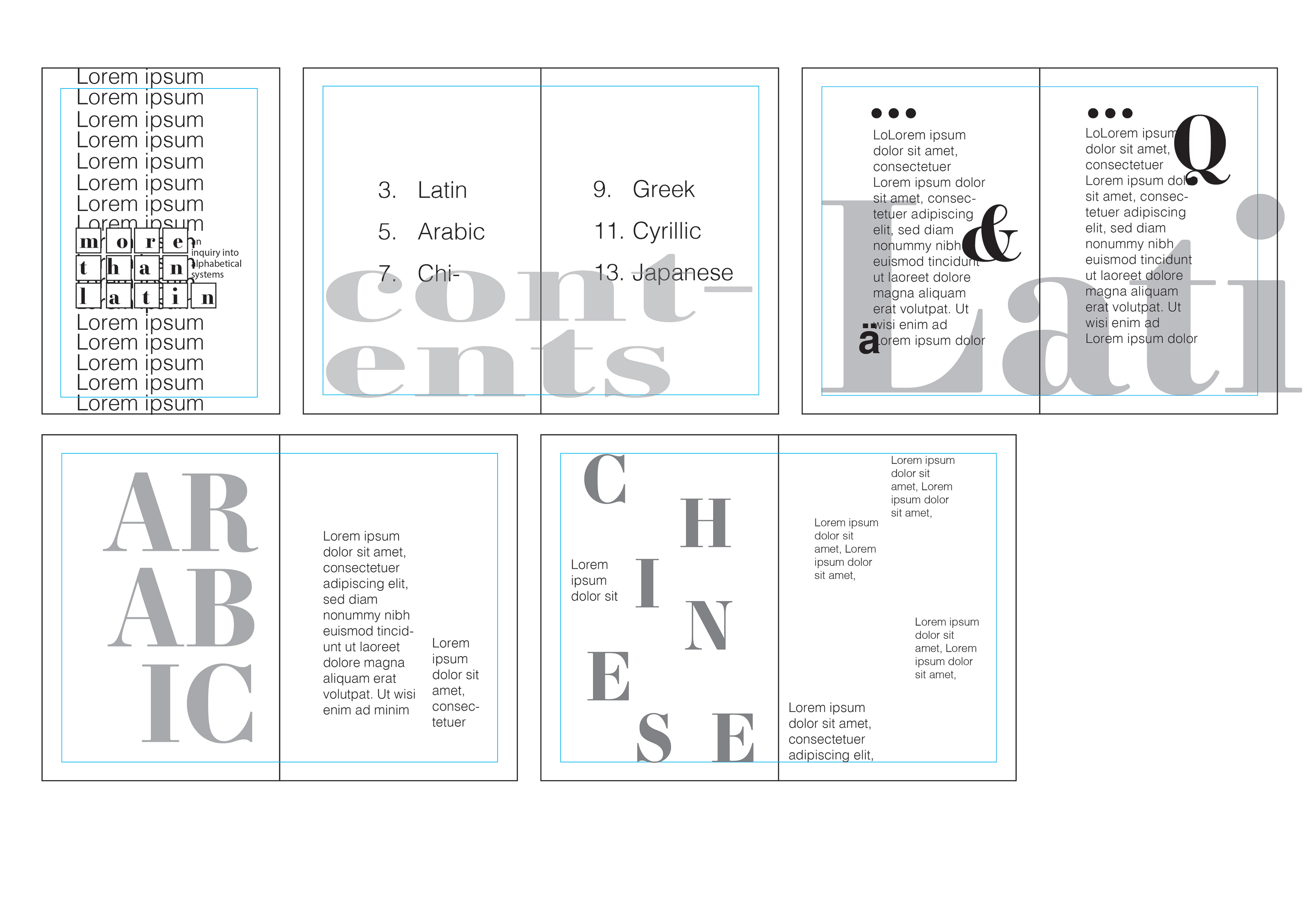
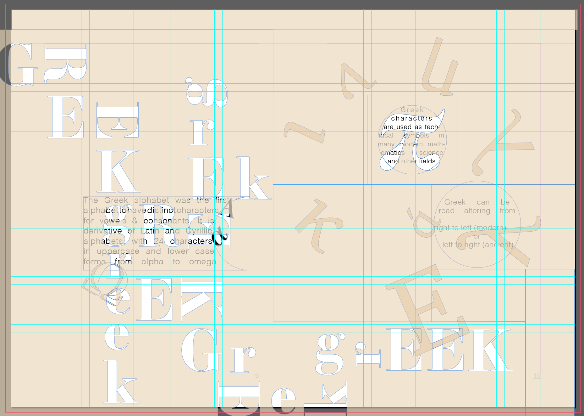
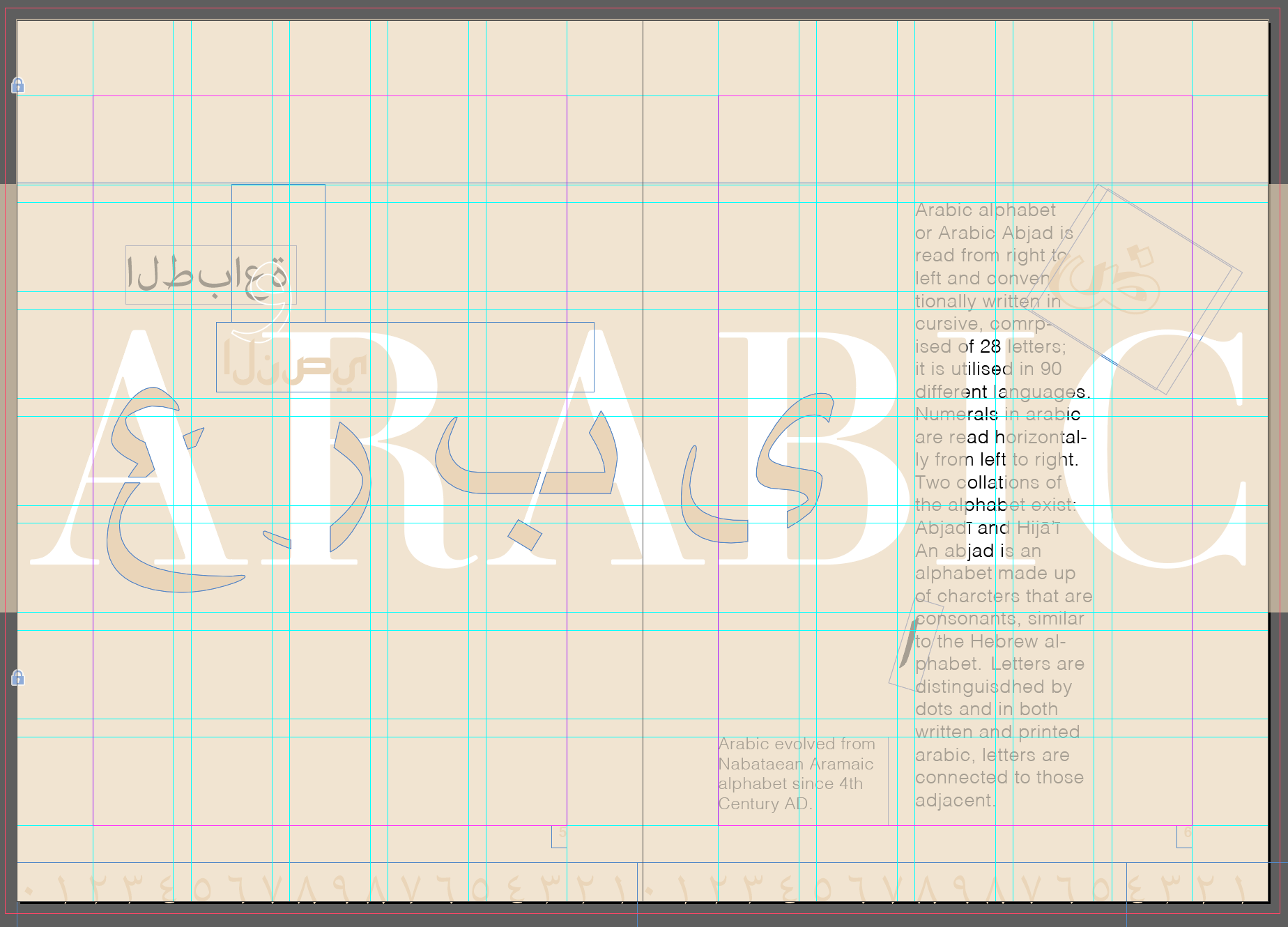
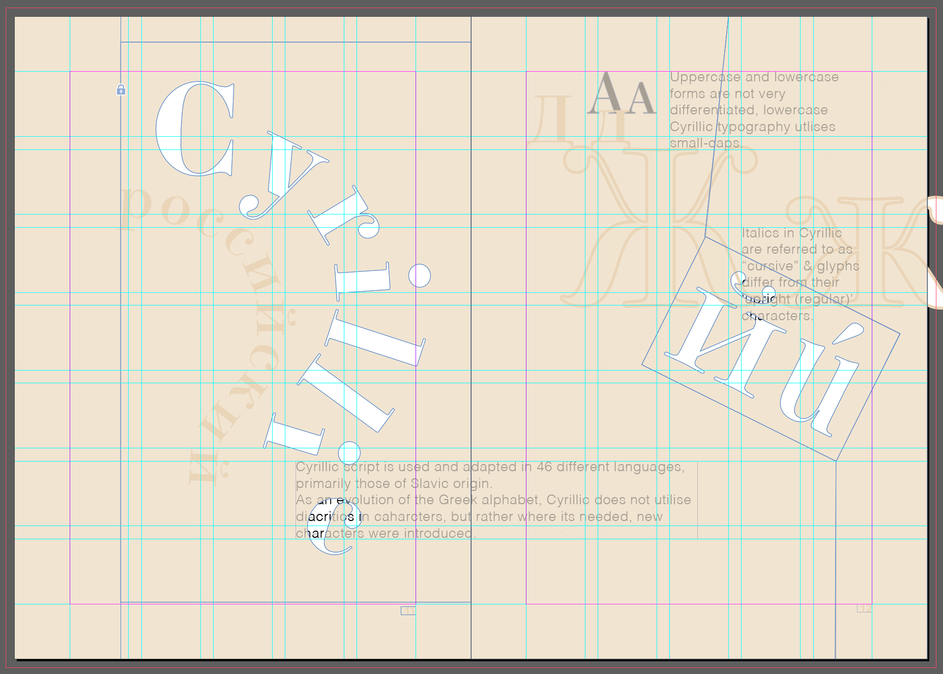
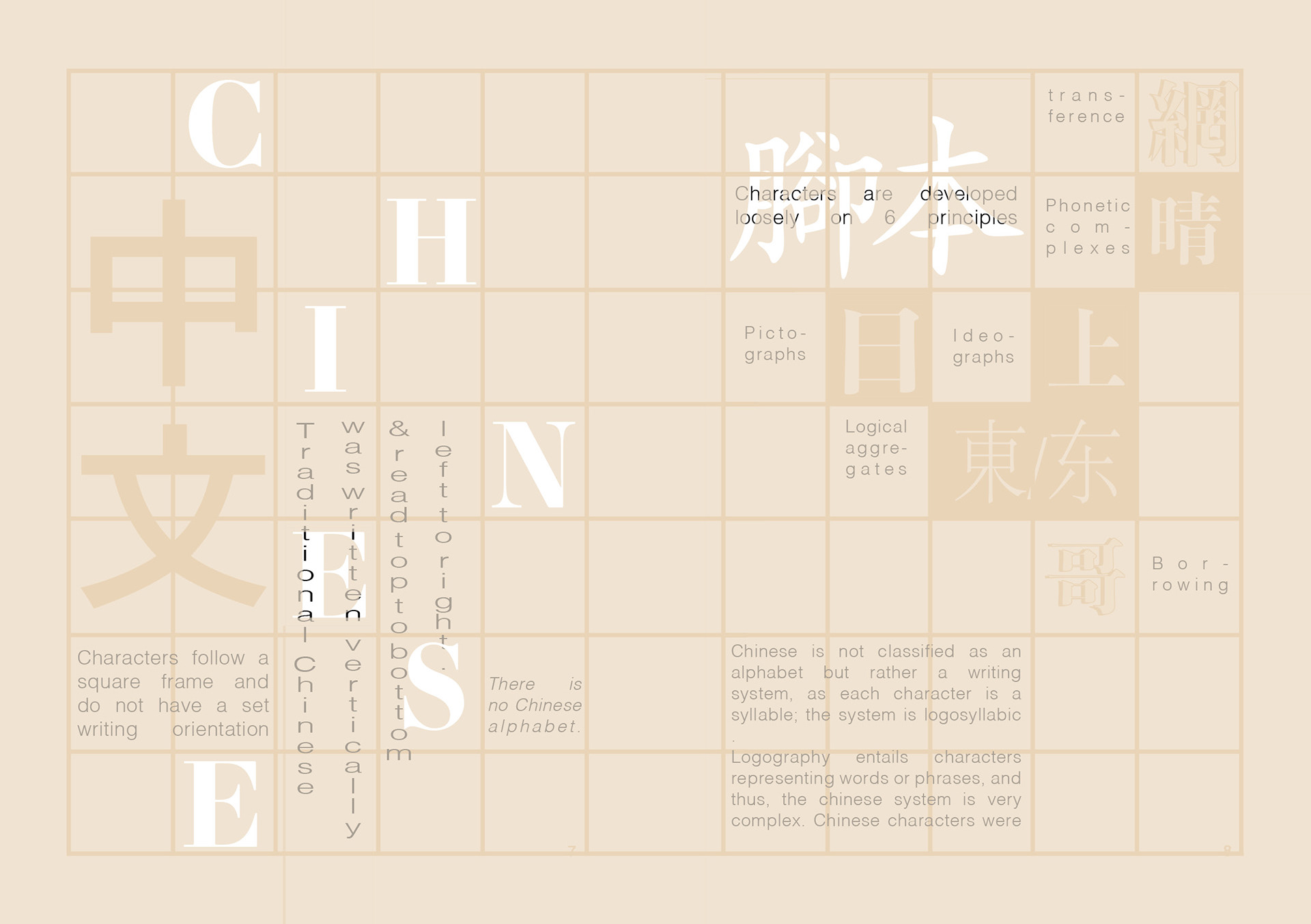
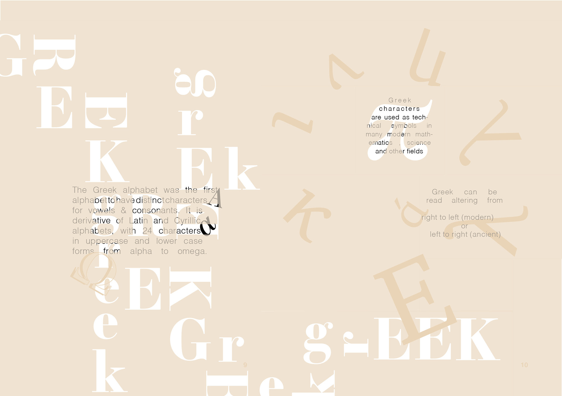
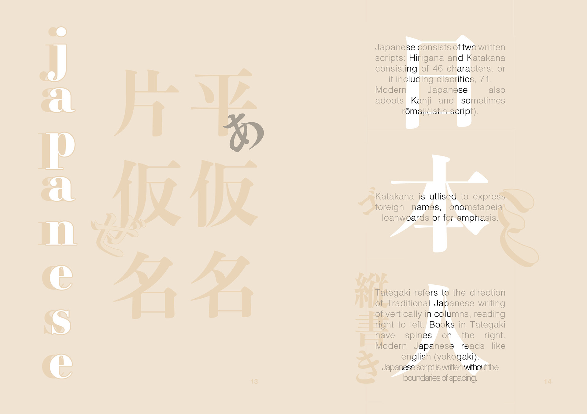
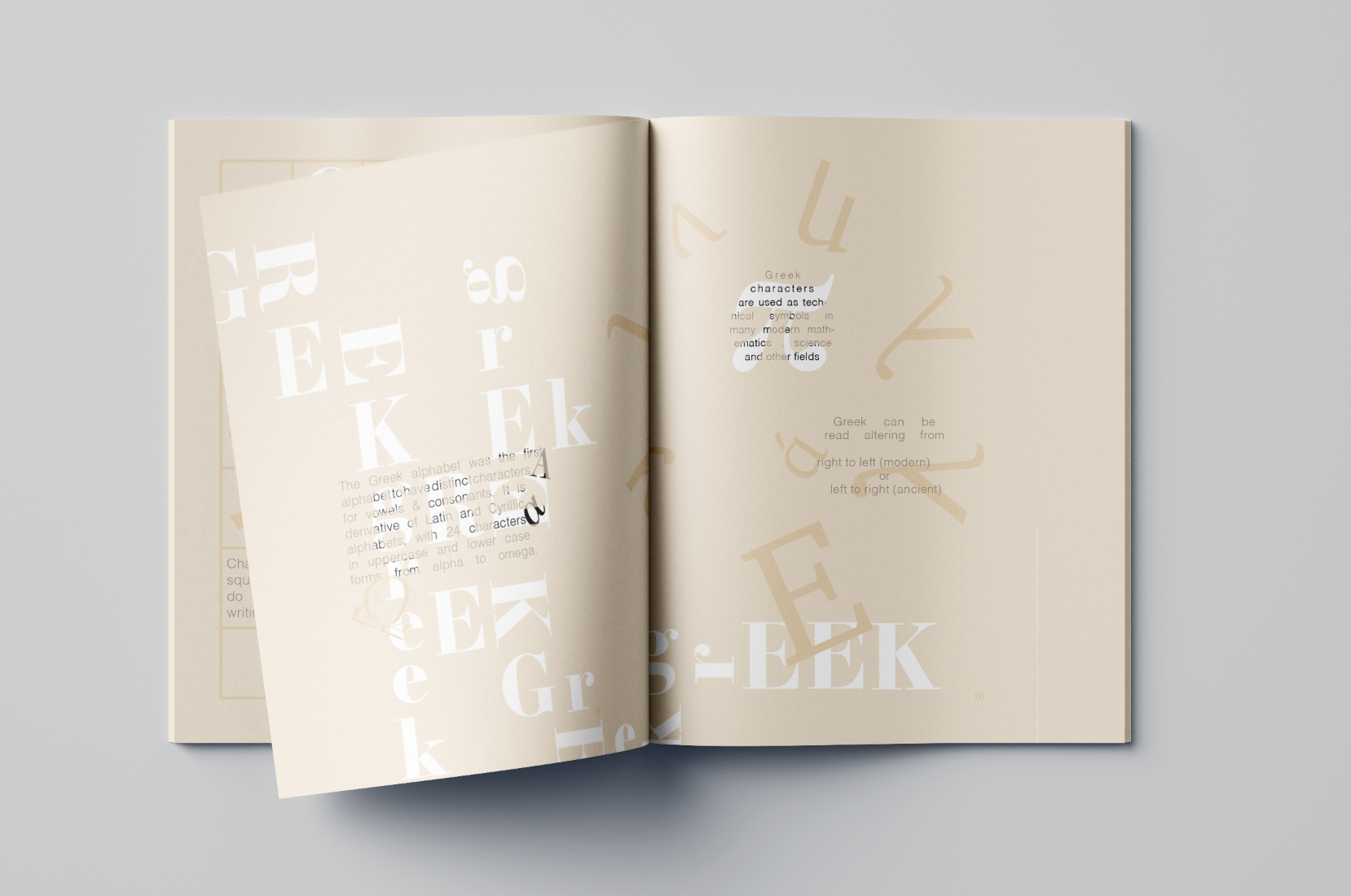
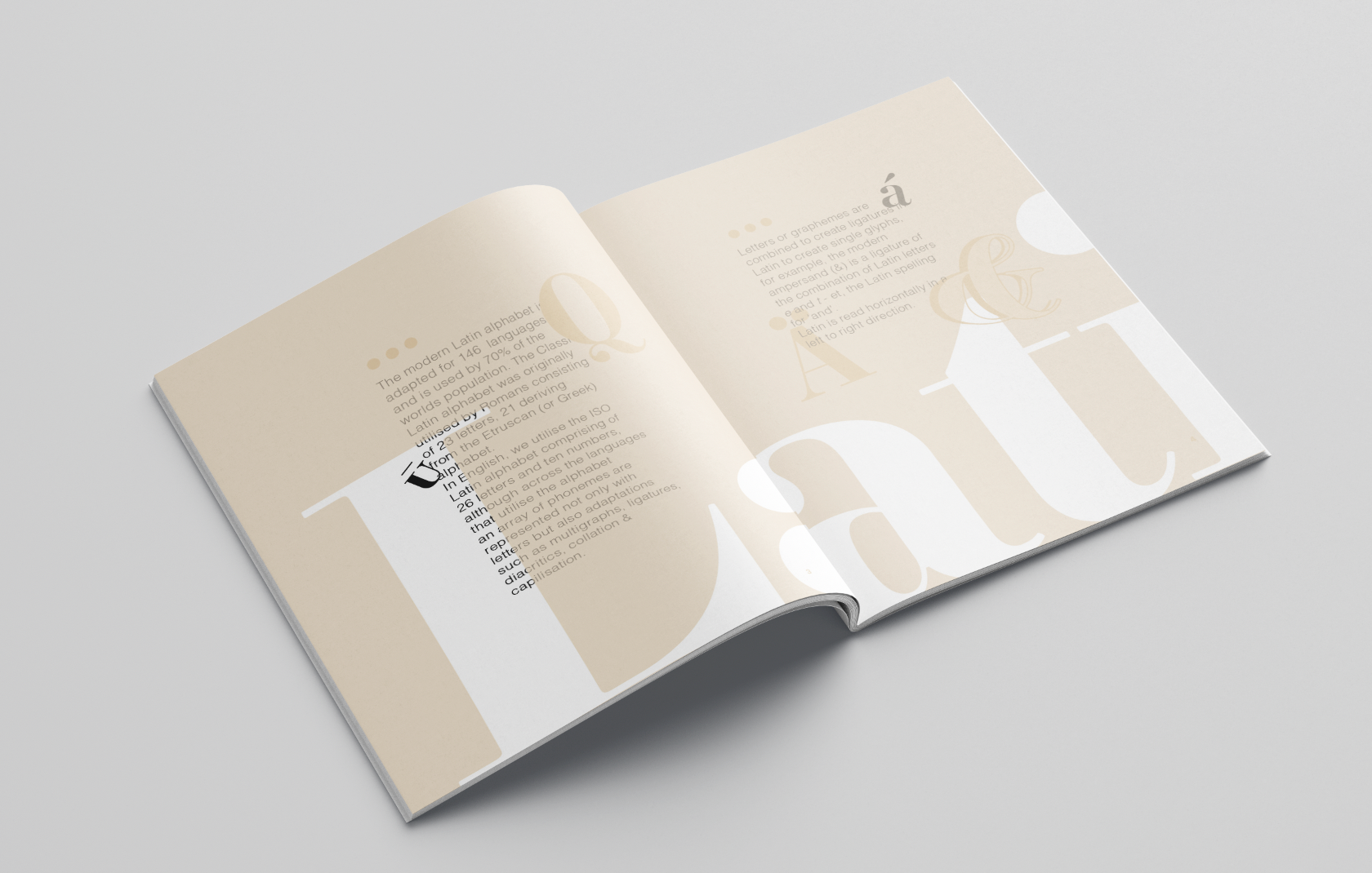
I utilised different scripts and available typefaces that exhibited the alphabets and types of typography in such scripts. All text is left aligned using a multicolumn grid, with artistic glyphs positioned/aligned to balance these.
Adjusting transparency and opacity of elements and glyphs to create a layered dynamic on spreads.
References
-Johanna Drucker, 1994. The Visible World Experimental typography and Modern Art. University of Chicago Press. Retrieved from https://books.google.com.au/books?hl=en&lr=&id=y-xQn9Vsh2IC&oi=fnd&pg=PP15&dq=typography&ots=mviZfq0xIV&sig=imm73WjhSFIiDUw08-xH3-nqnRo&redir_esc=y#v=onepage&q=typography&f=false
-Eugenia Luchetta, Nov 18, 2019. FUTURISM AND GRAPHIC DESIGN: THE TYPOGRAPHICAL REVOLUTION AND INCREDIBLE BOOK-OBJECTS. Pixart Printing. Retrieved from https://www.pixartprinting.co.uk/blog/futurism-book-objects/
#dvb201 Task 7 - Gabriella Dudman N10171070